Goals
To establish the first visual identity for an emerging app, creating a brand that communicates movement, trust, and accessibility while supporting future growth across digital and physical touchpoints.
Challenges
Design a cohesive brand system from the ground up that feels intuitive, reliable, and modern. The identity needed to translate seamlessly across app interfaces, marketing materials, presentations, and social platforms—while clearly conveying the concept of motion and efficiency.
Explored the intersection of mobility, convenience, and trust within the gig economy and delivery space.
Identified key user expectations around reliability, ease of use, and clarity—ensuring the brand would feel both approachable and dependable.
Visually, the direction focused on balancing movement with structure—avoiding overly complex or playful cues in favor of a streamlined, modern system that reflects efficiency and forward motion.

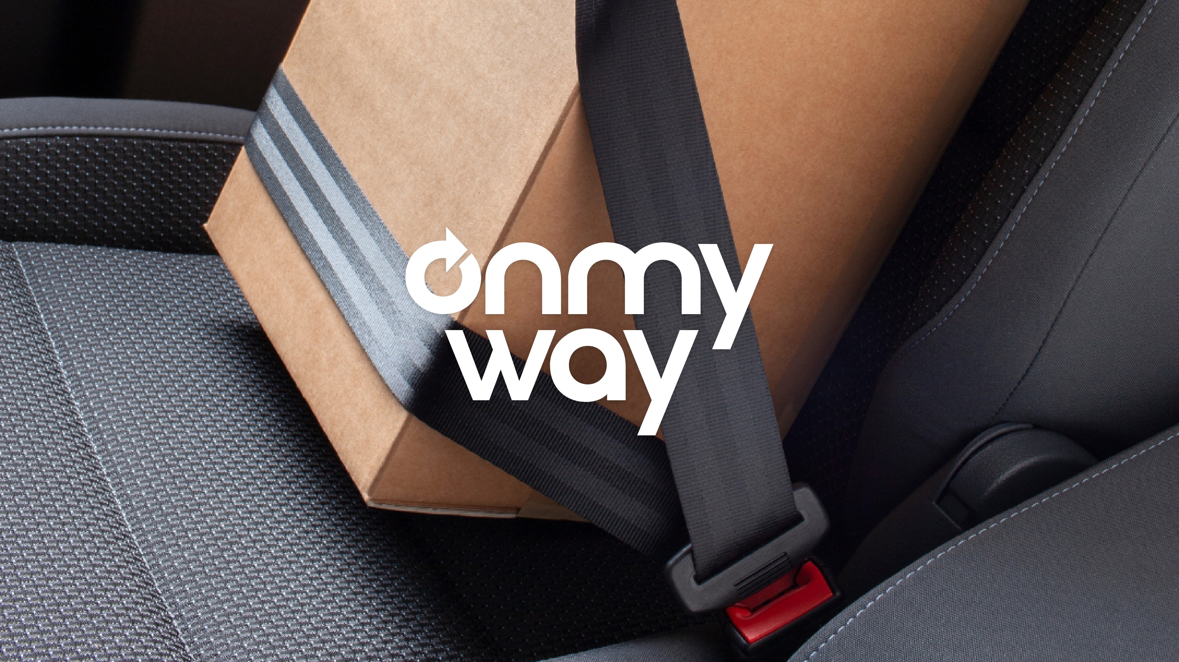
Developed a clean, modern visual identity centered around movement and direction.
The logo features a streamlined arrow motif, symbolizing forward motion and the fluidity of travel. A carefully curated color palette reinforces a sense of trust, clarity, and approachability.
To ensure consistency and scalability, a comprehensive set of branded templates was created for social media, internal communications, and external presentations—establishing a cohesive system that supports both user engagement and business growth.


A foundational brand identity designed for clarity, scalability, and recognition
A distinctive logo system that visually communicates movement and efficiency
A cohesive visual language applied across digital, print, and presentation materials
Flexible, repeatable templates enabling consistent communication across all touchpoints
