Problem
Maccabee Coaching required a more cohesive and elevated visual presence to match the quality of its services. Existing branding lacked clarity and consistency, resulting in a presentation that felt visually fragmented and less professional.
Goals
The goal of this project was to refine and implement a clear, unified visual identity while improving the communication of services—particularly across copy-heavy materials. The redesigned system prioritizes structure, readability, and cohesion, ensuring information is presented in a way that is both accessible and engaging for parents and students alike.
Challenges
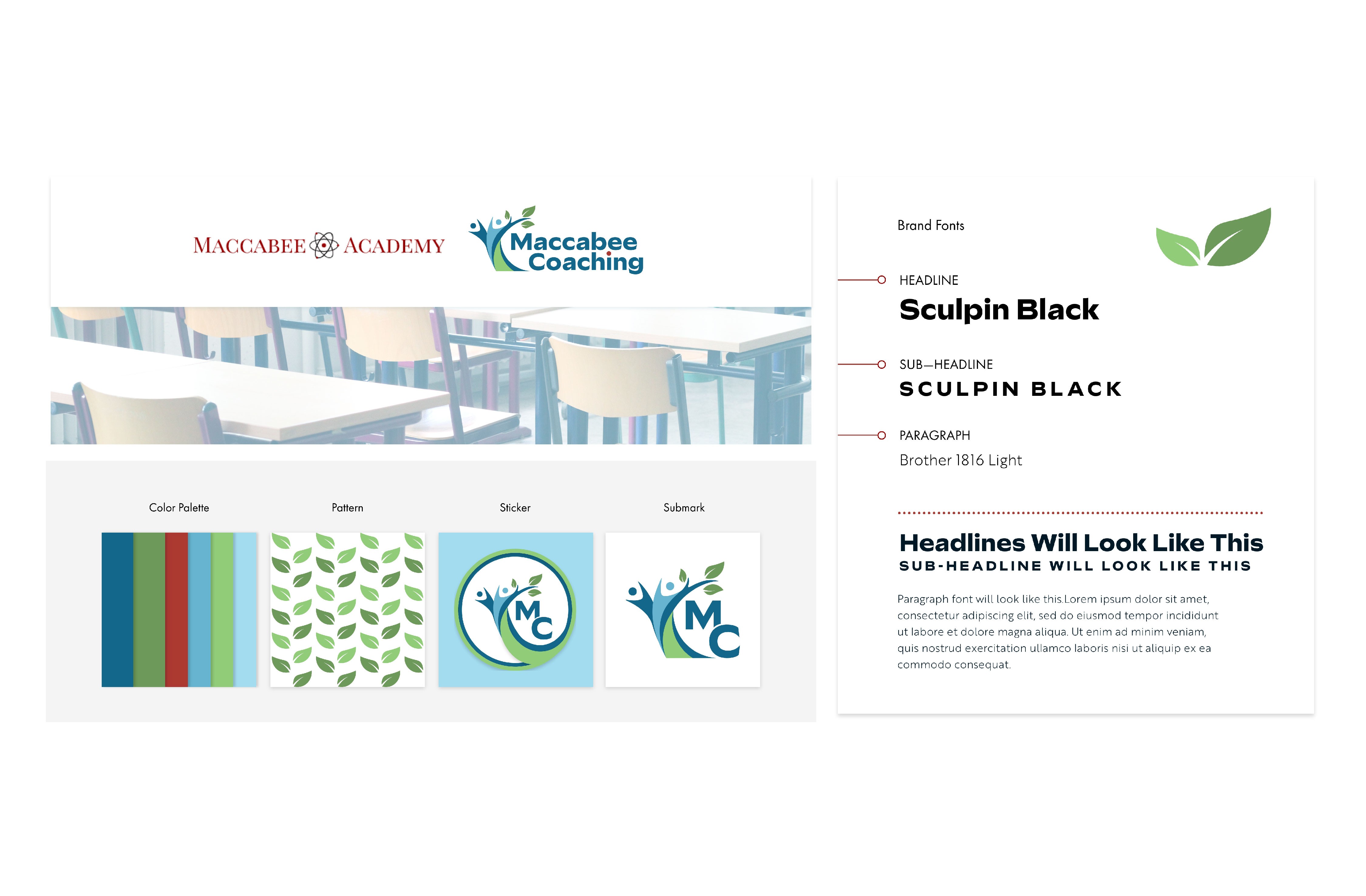
Refined an existing brand identity without losing recognition or connection to the parent brand
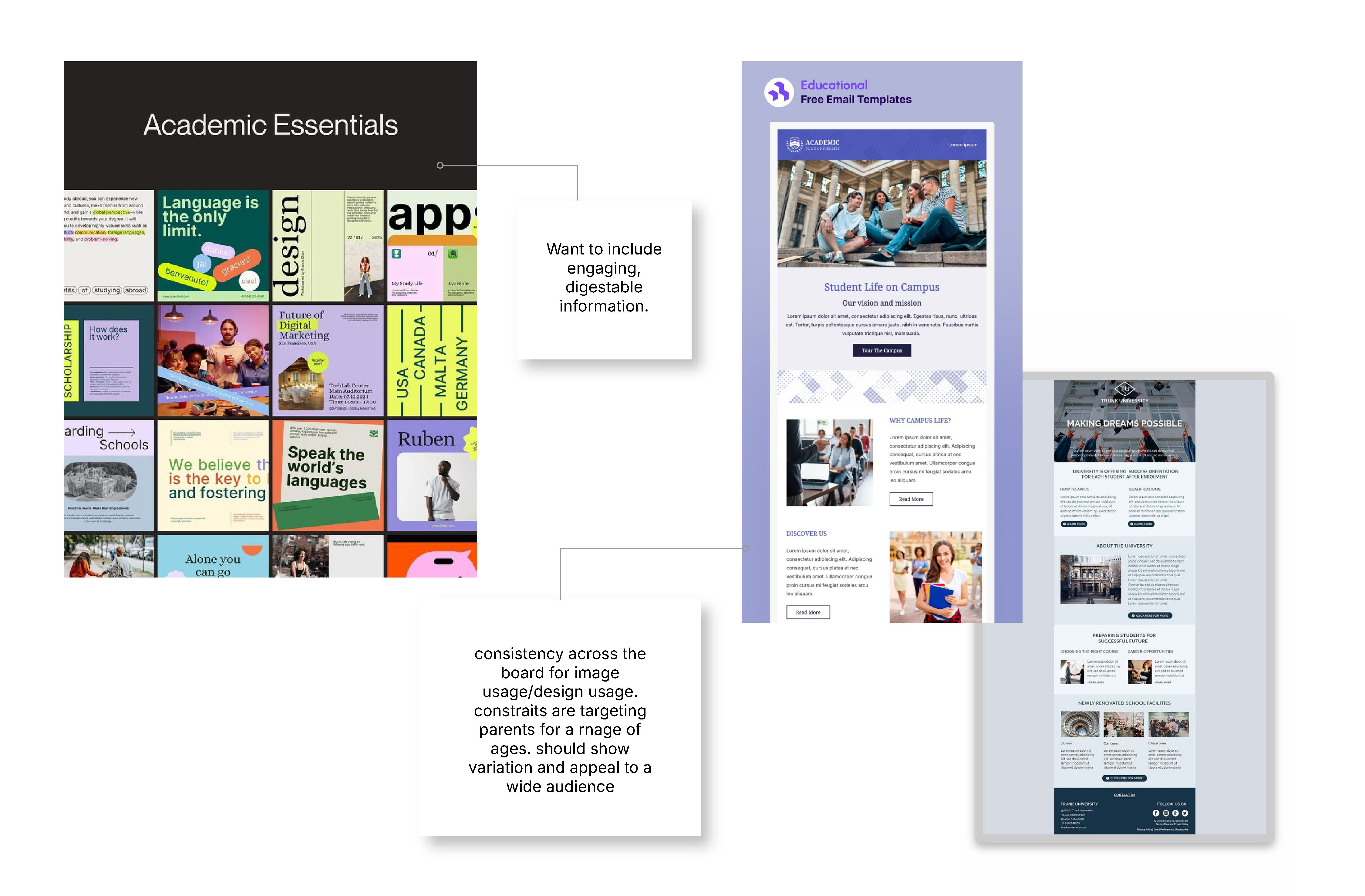
Structured copy-heavy content to improve clarity, readability, and engagement
Designed for a broad audience spanning multiple age groups and academic needs
Balanced simplicity with the depth required for educational materials
Built a flexible, digital-first system adaptable across platforms
Established visual consistency across previously fragmented materials
Delivered scalable solutions within a fast-paced timeline
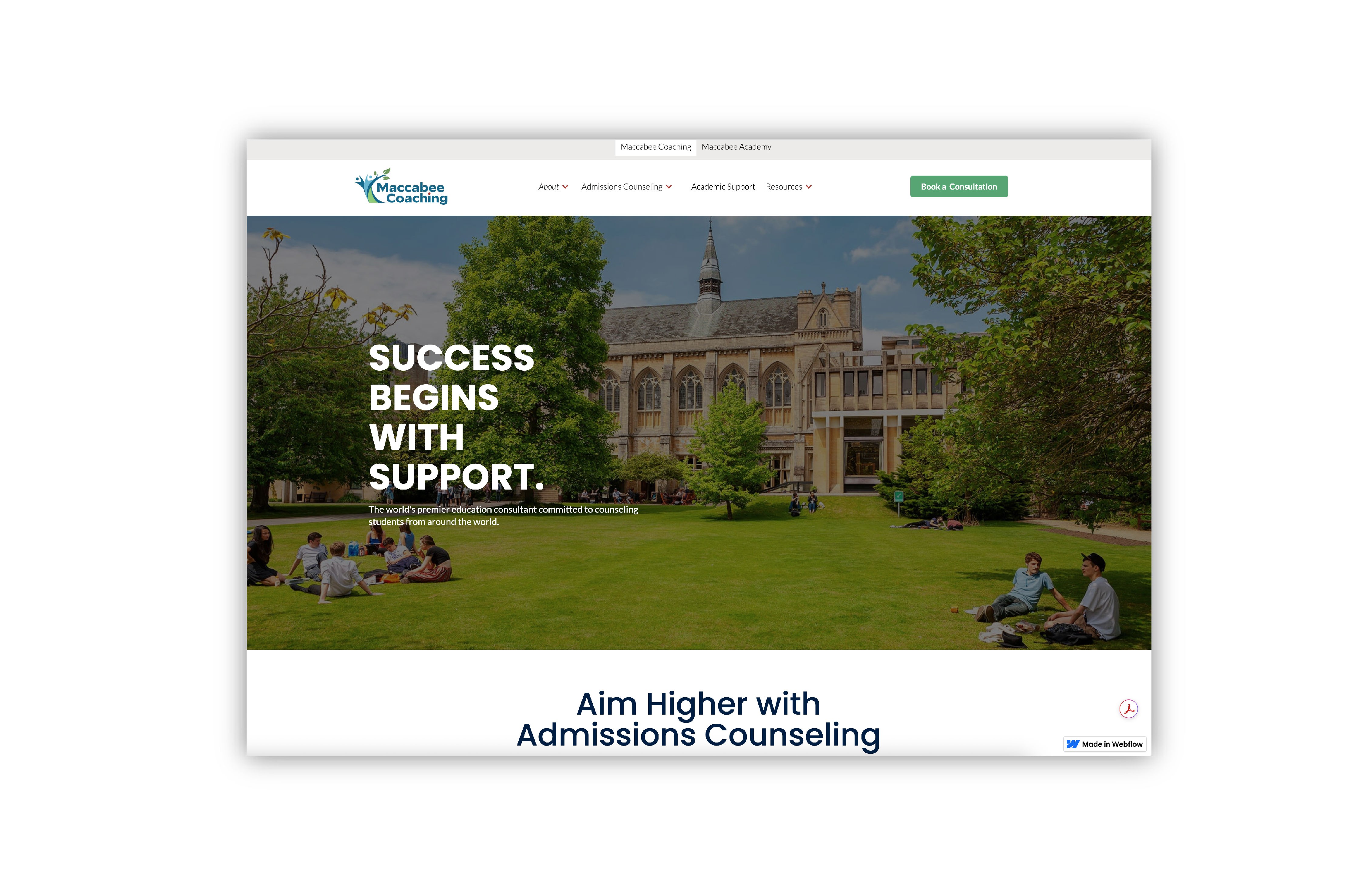
Maccabee Coaching faced challenges in attracting new clients and clearly communicating its value, with website and marketing content that lacked depth, structure, and emphasis on key information. This revealed a need for stronger hierarchy, improved readability, and more intentional design to support communication.
Additionally, inconsistencies across touchpoints—including social media, email, internal documents, and print—highlighted an opportunity to create a more cohesive visual system that strengthens clarity, recognition, and trust.
A structured content system was developed to improve hierarchy, readability, and overall flow, making it easier for prospective clients to understand Maccabee Coaching’s services and value.
To support both external communication and internal alignment, a suite of cohesive materials was created—including email templates, social media assets, and a brochure—designed to present information in a more modern, digestible format. These tools not only enhanced outreach to parents, students, and educators, but also equipped internal teams with clear, consistent resources to communicate offerings more effectively.
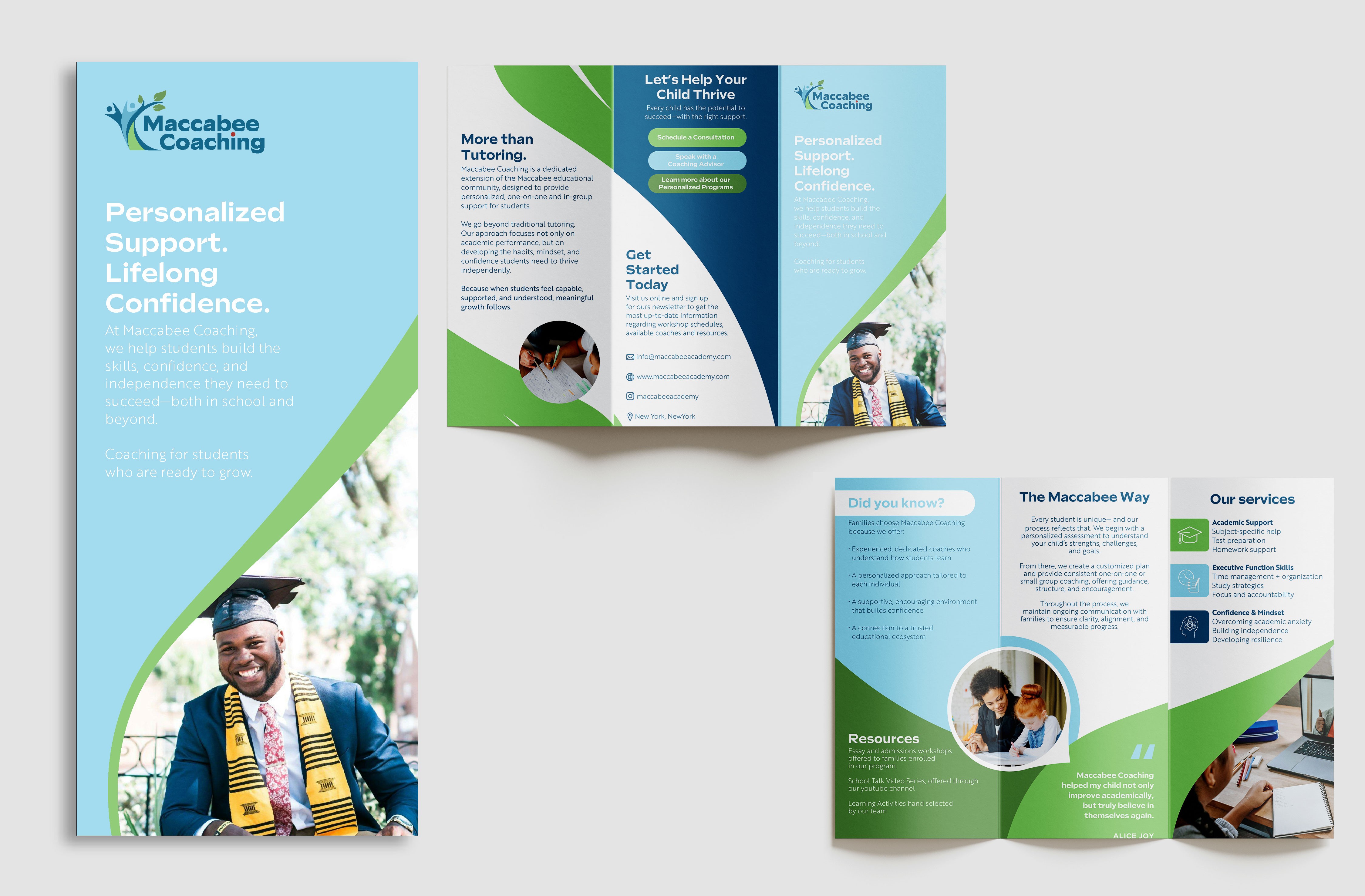
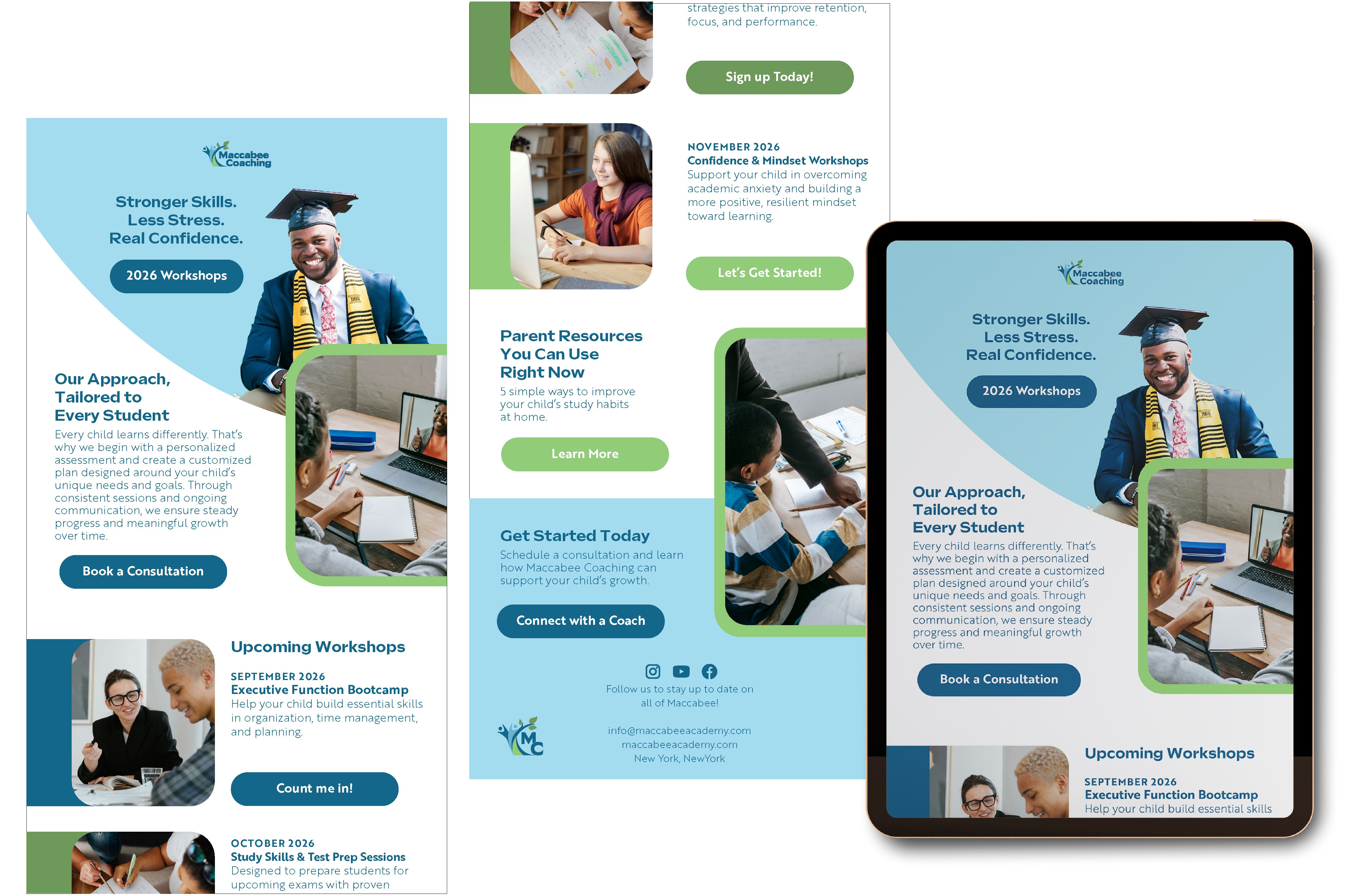
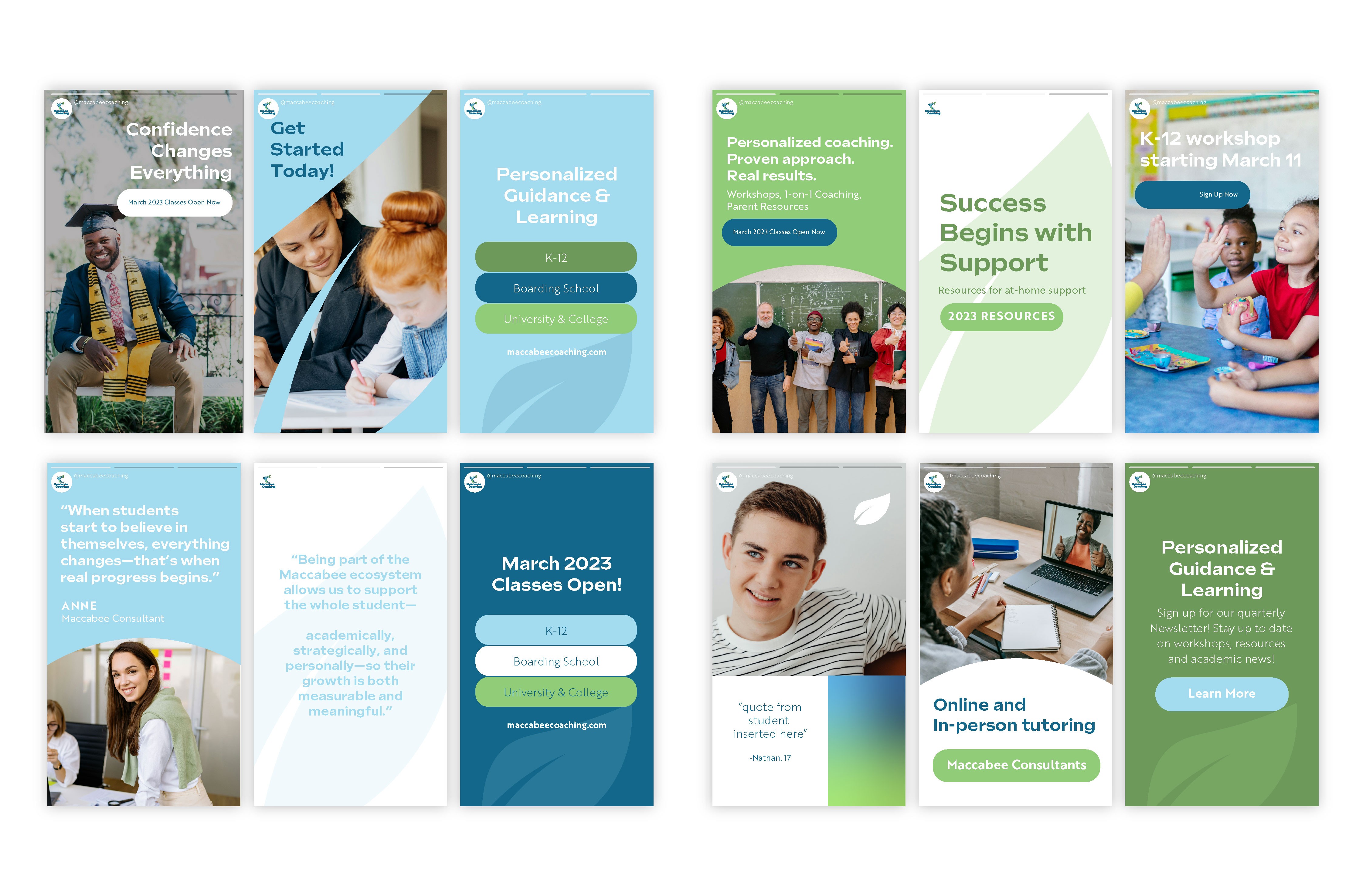
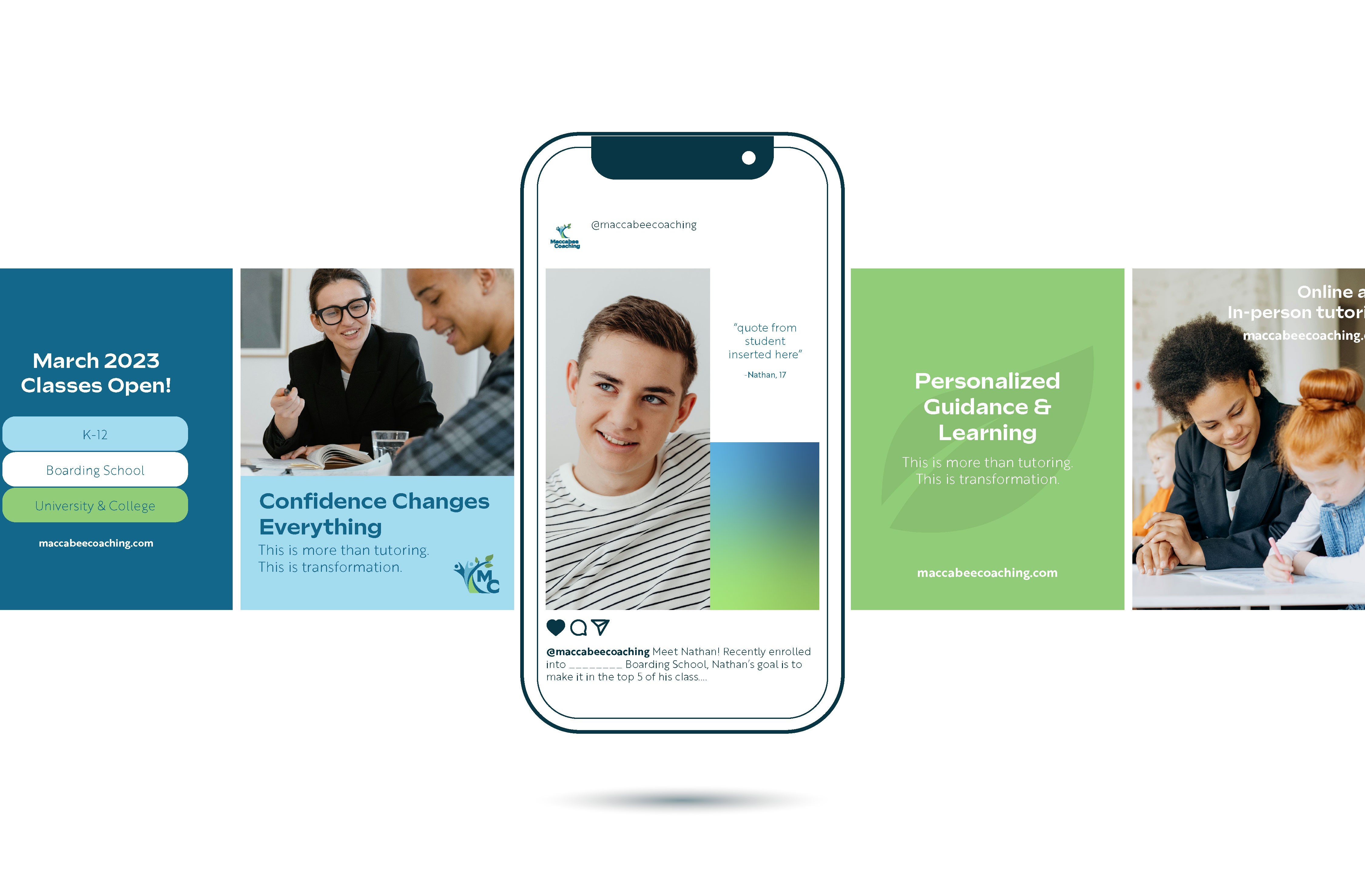

A cohesive, professional, and digital-first visual system that clarified key information for parents, students, and educators. Consistent email templates, social media assets, brochures, and internal resources improved communication, strengthened brand recognition, and supported client acquisition, while providing a scalable framework for future growth.

